BATHROOM - JÄMTLAND GREY

My name is Rebecka, and I am an interior architect and designer at Östersjösten Aktiebolag. Through my design, I create experiences, encounters, and history. My focus is always on "human interactions," and I have a strong curiosity for spatial design. By blending continental style with Nordic minimalism, I create unique projects that tell a story. I place great importance on details and quality, constantly fascinated by how interior design can impact people's daily lives and situations. With eight years of experience as an interior architect, I am grateful to carry out my passionate work every day.

Where do you find inspiration?
Everywhere, actually. Small and large details in nature, architecture, and objects are a constant source of inspiration for me. I browse through loads of interior materials daily, but most of my inspiration still comes from within. It's a kind of longing or perhaps an inner voice that wants to create order, balance, and harmony. I take the client's thoughts, ideas, and challenges through my imaginative filter and then try to recreate an environment that reflects that. I pay close attention to how things are shaped and in what order they should come together, always starting from an intuitive hierarchy. For me, it's crucial to seamlessly integrate the environment I'm working on with the rest of the home, the location we are in, and the personality of those who will use the intended space.

About the project
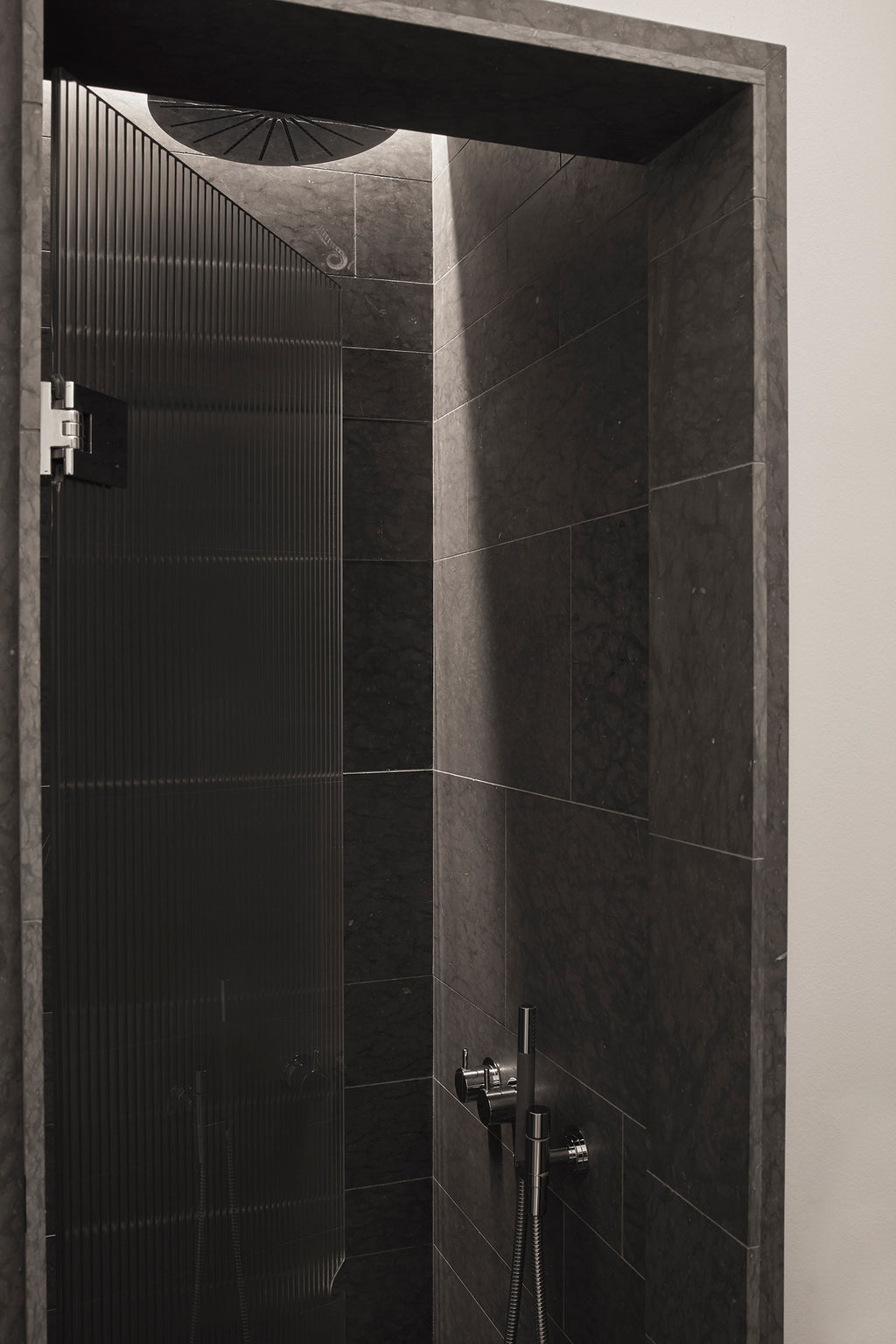
The brief was to turn a small space into a "grand bathroom." Half was a tiny toilet, and the other, a wardrobe. Despite the limited space, the bathroom was divided into two sections—one for a guest toilet and the other for a private shower corner. The shower area, accessed from the guest toilet through a built-in glass door, was entirely covered in limestone from Jämtland grey, creating a cozy, cave-like atmosphere. The limestone floor seamlessly extended from the shower to the toilet area without a threshold. Walls from the shower framed the glass door, while others were painted in muted white with a 10 cm high baseboard. To highlight the washbasin as the focal point, a kidney-shaped bowl was created, slightly elevated from the rear ledge where the faucet rested. A mirrored cabinet, spanning wall to wall and up to the ceiling, matched the apartment's turn-of-the-century style.
Choice of stone
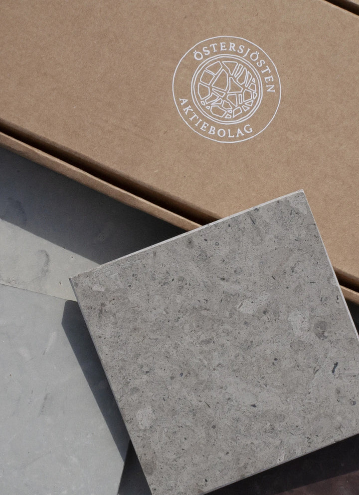
From the very beginning, when I saw the potential of this small space, I was instinctively drawn to a darker stone. The choice landed on Jämtland Gray, as it is a fantastic stone full of fossils with a very beautiful marbling. Both the floor and walls are randomly laid with four different widths of the falling lengths to create a playful arrangement of the stone. Faucets from Vola and chrome details were added to introduce a bit of bling. The large mirrored cabinet, spanning from wall to wall and all the way up to the ceiling, adds space (and storage).

- choosing a selection results in a full page refresh
